When I signed up for this course, I have to admit, I didn't think I'd learn anything but I knew there was going to be an advanced course and that you'd probably have to take this course as a pre-requisite.
This week's Jessica Sprague Up and Running covered a lot of different things and I learned quite a bit. I now know how I should be cutting my digital paper, how to evenly space things and trim off excess photo. If I learn as much next week as I did this week, I'll be thinking that my $40 was well spent. I've bought books that cost that and haven't been as useful/practical.
Anyway... ah yes... I'm supposed to be posting my layout.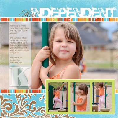
I want to quickly explain a couple of things. First, I modified the layout to make my 3 supporting photos rectangular and not square (as JS planned). I just couldn't crop these photos into squares that made any sense as the climber didn't show.
Second, I'm really happy with my title font selection. It is a mix of Renaissance and Base 02 which is a grungy high impact font. The idea is to fool you into thinking elegant and then to be shocked with the grungy "independent" statement. I totally love this 2nd font (who knew you could love fonts?) and might be throwing out all my alphabet stamps (ok, not really, but I do love this stamped look).


0 comments